celebrating the whimsy & joy of a beloved pixar film.
up
title sequence
title sequence
up
title sequence
title sequence
colors in use:
#86bfe4
#e0d8d3
#86bfe4
#e0d8d3
#d33414
#e8cc2d
#58b439
#e8cc2d
#58b439
#3014d3
#e8a12d
#c214d3
#c214d3
fonts in use:
chaloops
chaloops
skills:
motion design, illustration
motion design, illustration
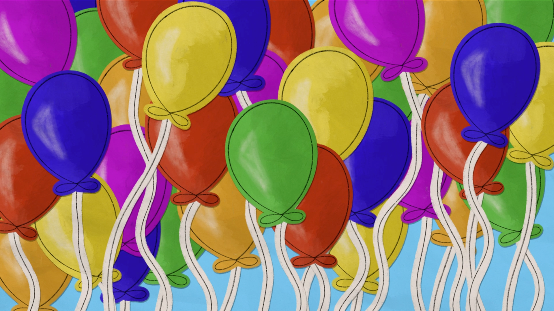
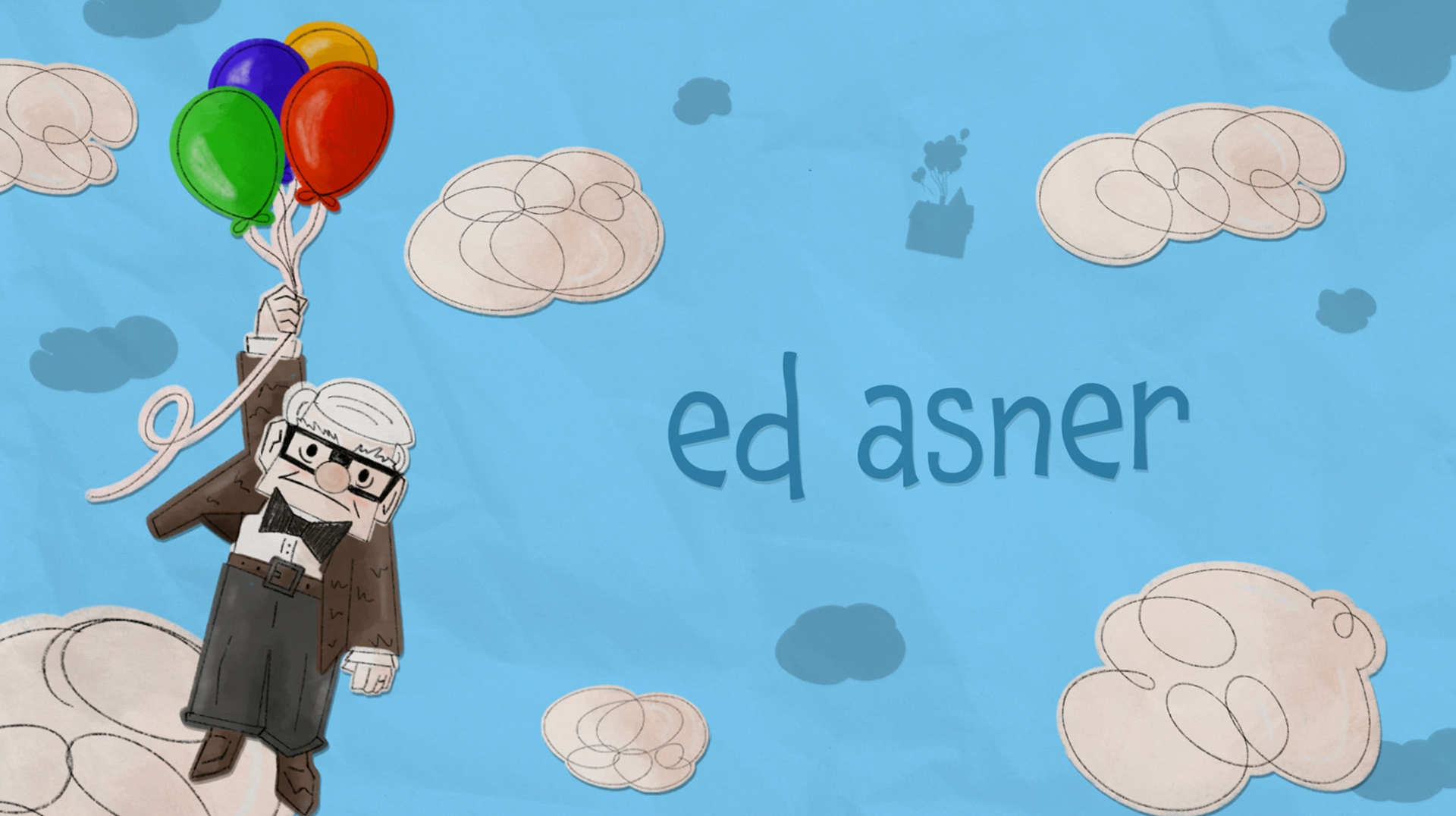
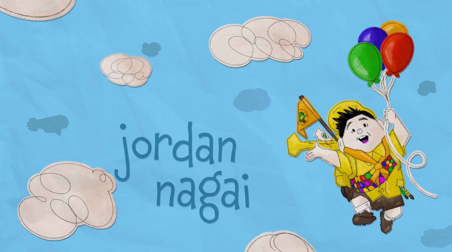
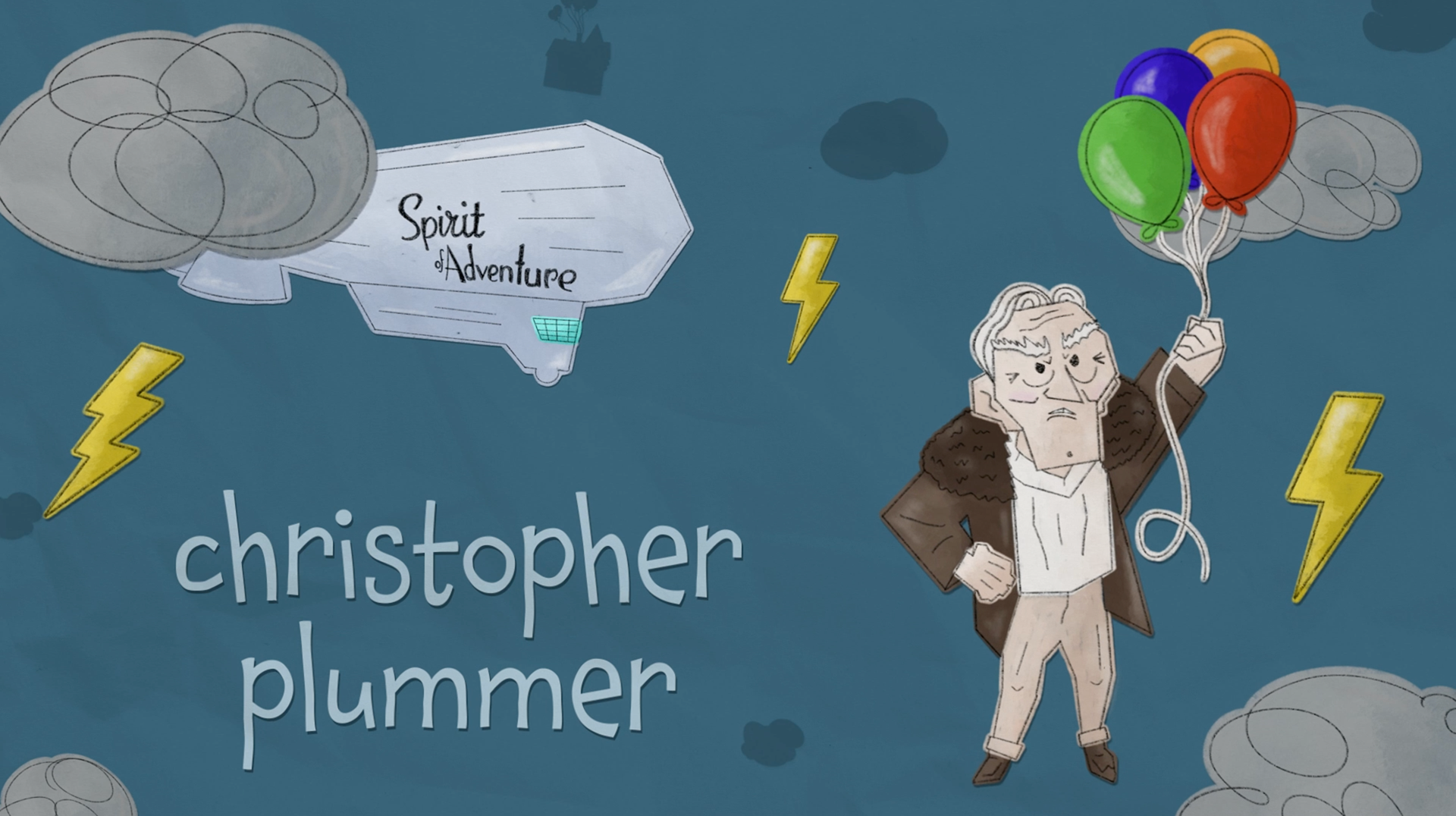
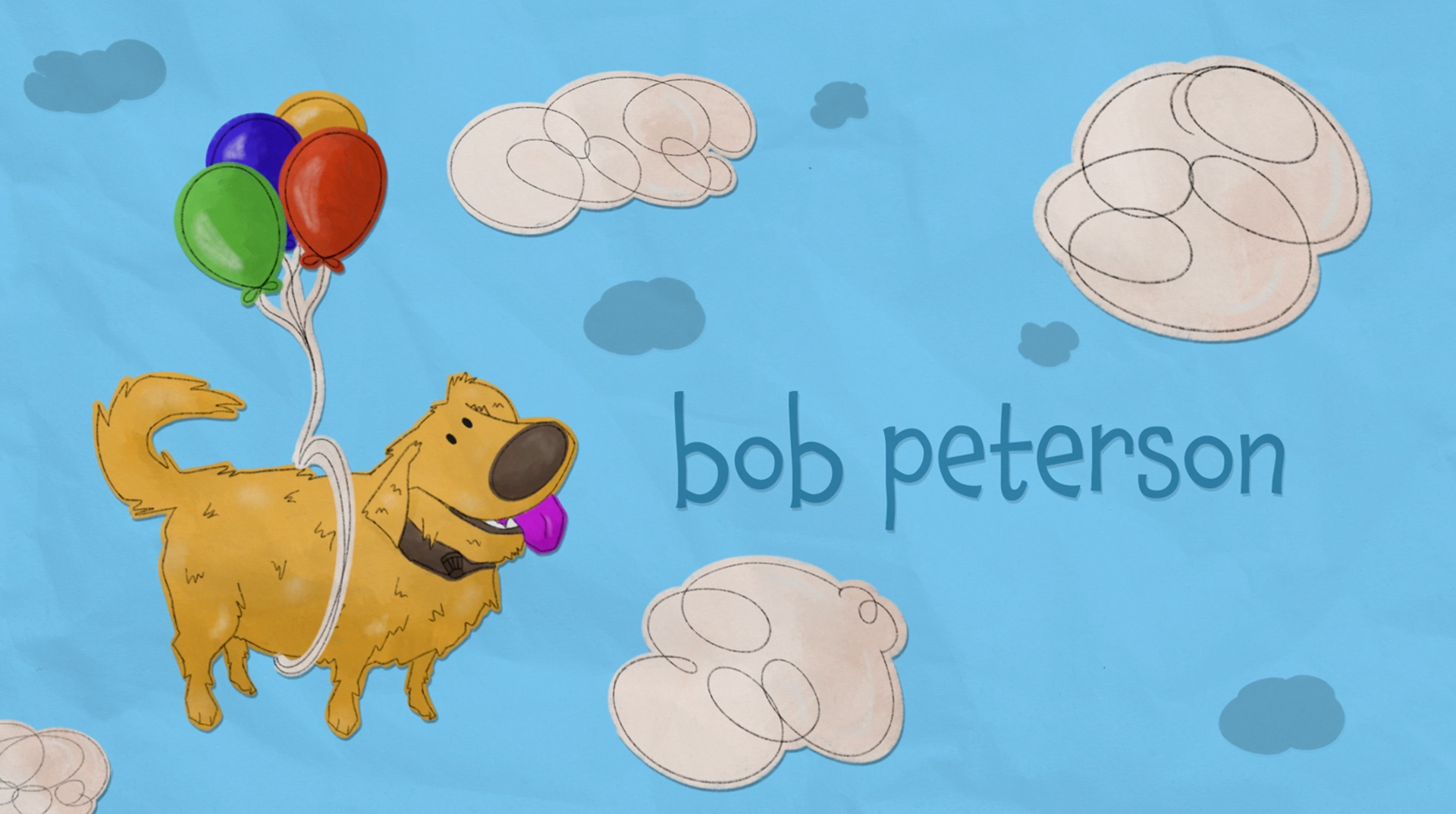
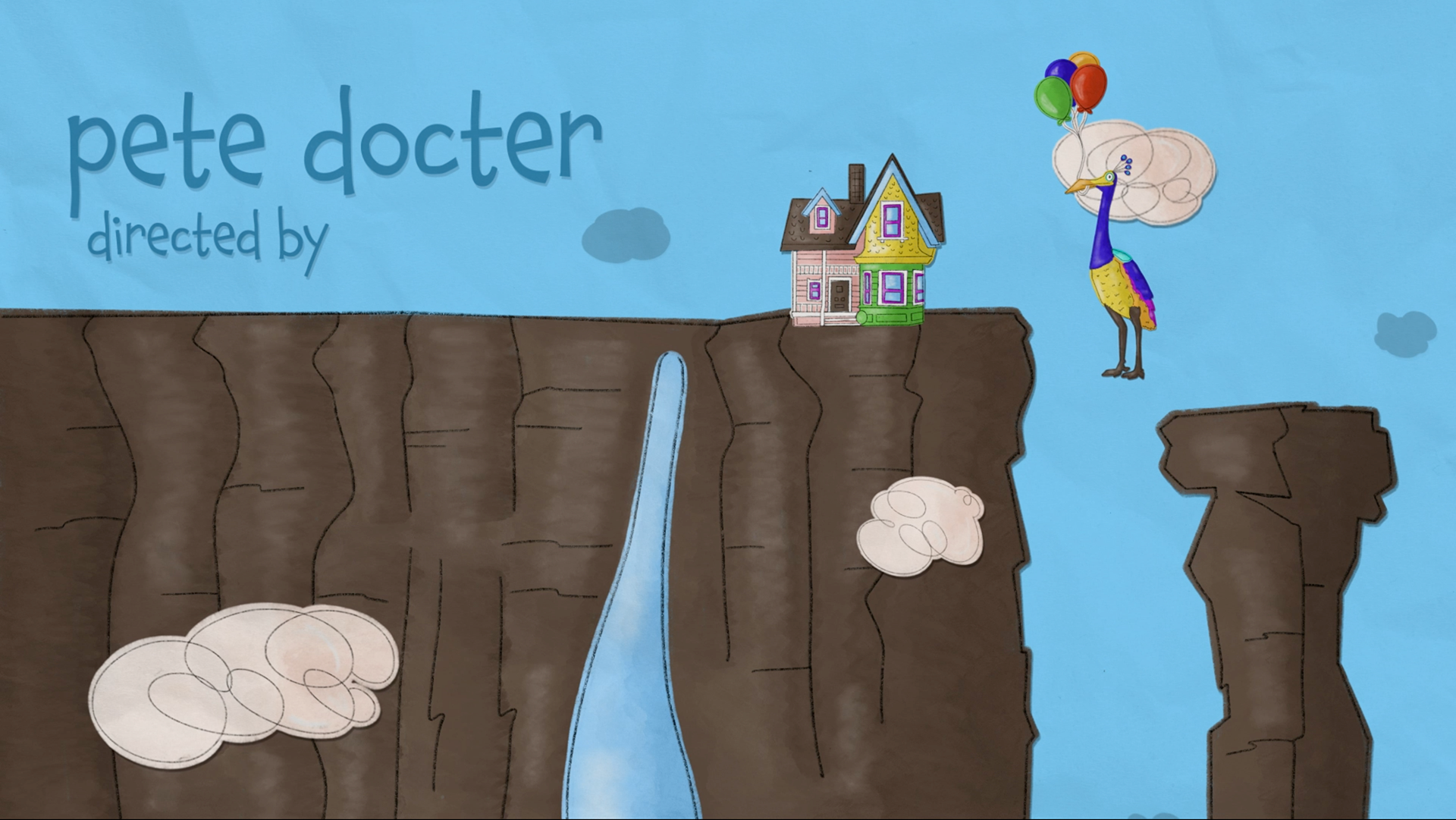
Up’s title sequence utilizes a bright color palette, inviting textures, and a playful illustration style to welcome the viewer into the world of the film. The project carries on the motif of Carl’s Adventure Book, bringing the viewers onto the textured page to float alongside the characters as they appear. The 2D animation style also has a subtle stop motion paper animation feel to allude to the Adventure Book as well as embrace the lighthearted spirit of the film. Although quite simple, the illustration style embodies the persona of each character. Pairing quick line drawings with watercolor brushes, the style embraces the ability to see the artist’s hand, which thematically ties into the scrapbook narrative. The typeface selected for the project, Chaloops, also helps in establishing tone, with its bouncing x-height and childlike strokes. The sequence opens with balloons flooding the screen, setting a colorful, whimsical tone for the piece and creating anticipation for the characters that will soon follow. The visuals are supported with Up’s signature track, “Married Life,” which is featured prominently in the movie. With its confident, cheery style and distinct animation, the project wholeheartedly embodies the essence of the film, inviting all to seek adventure and welcome the friends they may meet along the way.